
The Product Design Basics Everyone Skips, and Why Your Designs Aren't Working Because of It
A beautiful design that nobody can use is not a design success. Here is why the unglamorous basics of product design matter more than beginners think, and what gets missed most.
Aug 07, 2026·7 min read
 7 min read
A new designer spends three days perfecting the color gradient on a single button. It looks beautiful. It also sits inside a navigation menu that nobody using the app can actually find, because nobody ever asked a real person to try using it first.
This is not a rare story. It is close to the default story of a self-taught product designer's first real project. The instinct to make things look good arrives early and loudly. The instinct to check whether things actually work arrives late, if it arrives at all. And the basics that would have caught the problem, the unglamorous, less exciting fundamentals, are usually the first things skipped entirely.
None of what follows is about talent. Every designer, self-taught or formally trained, makes some version of these mistakes early on. The difference between the ones who improve quickly and the ones who stay stuck is simply whether anyone ever names these specific gaps clearly enough to notice them.
The Research Nobody Wants to Do
Ask any working product designer what beginners get wrong most often, and research skipped entirely is almost always the first answer. It is easy to understand why. Research is slow. It involves talking to people, which is uncomfortable for a lot of self-taught designers starting out. It does not feel like “designing” the way opening a design tool and making pixels move does.
But designing without research means designing in the dark, guessing at what users want based on personal preference rather than evidence. A designer building a fitness app without ever asking a single real user whether they even want reminders, or what features would genuinely help them, is not designing a product. They are designing a guess, and shipping it with confidence.
The fix is not complicated, it just requires discipline most beginners skip. Talk to real users, even a handful, before designing anything. Watch how they describe the problem in their own words rather than yours. Let that shape the actual structure of what gets built, not just the color scheme layered on top of it afterward. Even five conversations with real potential users, done honestly, will surface more useful insight than weeks of solo speculation about what people probably want.
Skipping the Technical Fundamentals
The second most common gap is more surprising: beginners often skip the technical, structural fundamentals of design entirely, the parts that do not feel creative but hold everything else together. Grid systems are the clearest example. A grid establishes consistent columns, margins, and spacing across a design. Skip it, and layouts become uneven in ways that are hard to name but easy to feel, spacing that is almost but not quite consistent, elements that almost but not quite align. Users notice, even when they could not explain what is wrong.
Self-taught designers can absolutely produce excellent, professional work without formal training. But skipping structural fundamentals like grid systems, consistent spacing, and clear visual hierarchy is not a stylistic choice, it is a gap that shows up in the finished product whether or not the designer intended it. Formal design education tends to front-load these fundamentals precisely because they are boring to learn and expensive to skip. A self-taught path can absolutely cover the same ground, it just requires deliberately seeking these fundamentals out rather than assuming they will be picked up naturally by osmosis.
Consistency Is Not Optional
A related, equally common mistake: inconsistency across a design. Different button styles on different screens. Colors that shift meaning from one page to the next. A design system or style guide exists specifically to prevent this, one place that defines what a primary button looks like, what a heading looks like, what spacing looks like, so every screen feels like it belongs to the same product rather than several different ones stitched together.
Without that consistency, users have to relearn the interface every time they move to a new screen, even if each individual screen looks fine in isolation. The cumulative effect is a product that feels harder to use than it actually is, entirely because of small, inconsistent decisions nobody meant to make. Building even a minimal style guide early, just a handful of defined colors, one heading scale, one button style, prevents this problem far more effectively than trying to fix inconsistency after the fact across dozens of screens.
Designing for One Screen Size
More than half of internet traffic worldwide now comes from mobile devices, yet beginner designers still routinely design exclusively for a large desktop screen and treat mobile as an afterthought, if they consider it at all. A layout that looks polished on a wide monitor can break entirely on a phone screen, text cut off, buttons overlapping, spacing collapsing in ways that make the product look broken rather than simply unfinished.
Designing responsively from the start, not retrofitting it in afterward, is one of the clearest signals separating a beginner portfolio from a production-ready one. This matters especially for anyone designing with a Nigerian or broader African user base in mind, where mobile is often not just the primary way people access the internet, it is frequently the only way. A design that only works well on desktop is, in a very real sense, a design that does not work for most of its actual potential users.
The Cluttered Screen Problem
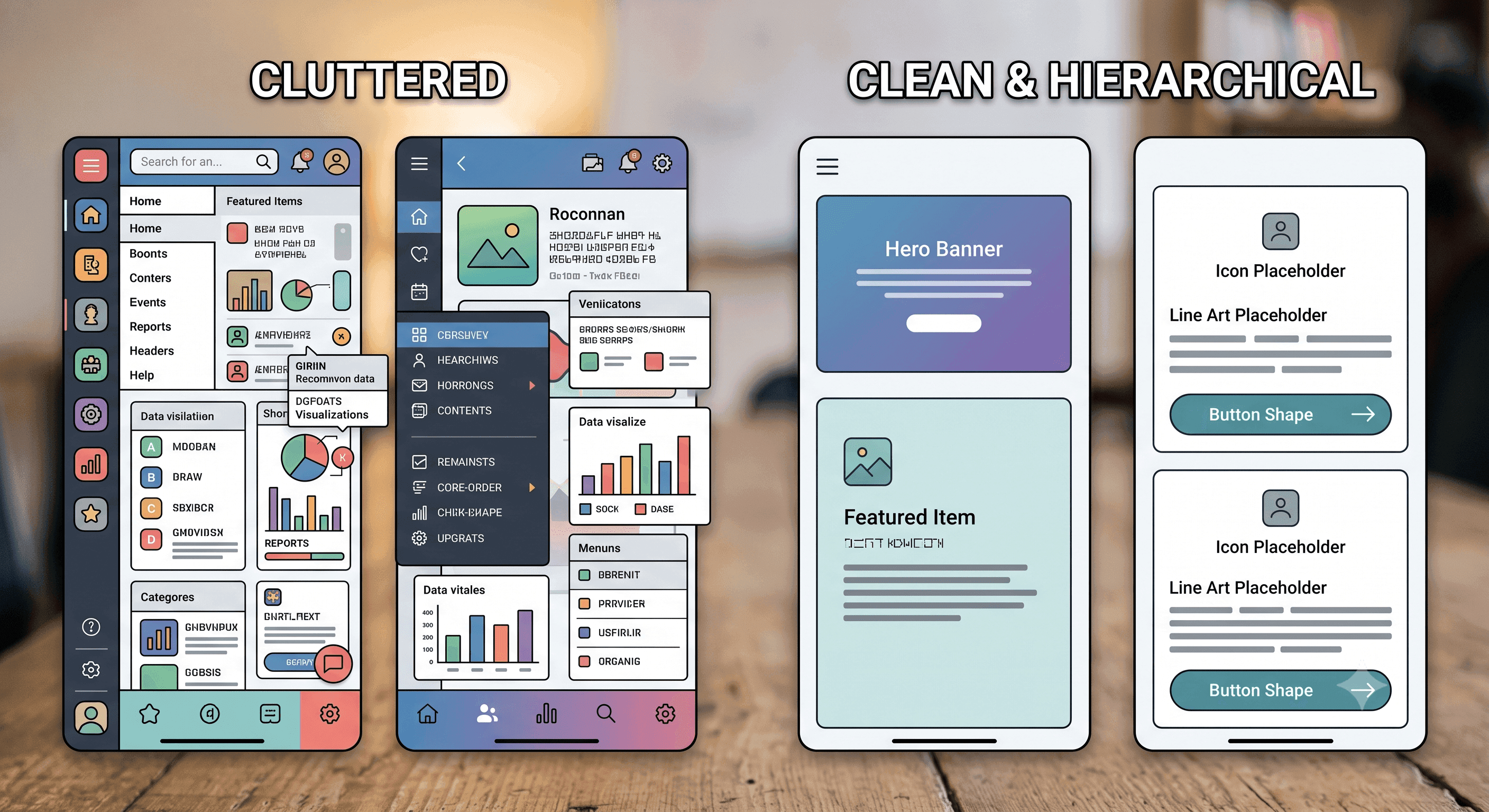
Good design is disproportionately about what gets left out, not what gets added. Prioritizing content ruthlessly, showing users only what they need in a given moment, and using whitespace deliberately to let important things breathe, matters more than cramming in every possible feature at once. A useful discipline here is picking, for any given screen, the single most important action a user should take, and designing everything else to visually support that one action rather than compete with it.
Never Testing With Real People
The last, and maybe most avoidable mistake: shipping a design that has never been shown to anyone outside the person who built it. Designers get close to their own work fast, close enough that confusing navigation or a hidden feature becomes invisible to them, simply because they already know where everything is.
Watching one real, unfamiliar person try to use a design, even informally, even just once, surfaces problems no amount of personal review ever will. It is uncomfortable to watch someone struggle with something you built. It is far more valuable than any amount of solo polishing. A simple, repeatable loop works well here even for beginners: design a rough version, test it with one or two people, note where they got confused or stuck, revise, and repeat. Each cycle catches problems the previous one could not see.
Designing for the Mistakes Users Will Make
A subtler fundamental beginners often miss entirely: good design anticipates where users are likely to make mistakes, and quietly prevents them, rather than waiting to display an error message after the fact. A submit button that stays disabled until a form is actually filled out correctly prevents an error state most designs would otherwise just react to after it happens. When an error genuinely cannot be prevented, the difference between a good and bad experience usually comes down to whether the resulting message is clear and specific, or vague and unhelpful. This kind of thinking rarely gets taught explicitly, but it separates designs that feel forgiving from designs that feel fragile.
File Organization: The Unglamorous Habit That Saves Everyone
One fundamental barely anyone mentions until it becomes a problem: how a designer organizes their actual working files. Disorganized layers, unclear naming, no consistent folder structure. Alone, it seems like a minor personal habit. In practice, it slows down collaboration, confuses anyone else who needs to work with the files, and makes revisiting a project weeks later far harder than it needs to be. A simple, consistent naming convention and folder structure, established from the very first file of a project rather than retrofitted later, is one of the least exciting and most practically valuable habits a beginner can build early.
What This Looks Like in Practice
Put together, these fundamentals suggest a simple, repeatable process rather than a checklist to memorize in isolation. Start by talking to real people about the actual problem, before opening any design tool at all. Sketch the structure roughly first, focusing on grouping and labeling things in a way that makes sense to a user, not just to the designer who already understands the product. Build with a consistent grid and a small style guide from the very first screen, not as cleanup work at the end. Design for the smallest realistic screen size first, then expand outward, rather than the reverse. Show the rough version to at least one real, unfamiliar person before considering it finished. Then repeat that loop, refining based on what that person actually struggled with, not based on personal taste alone.